
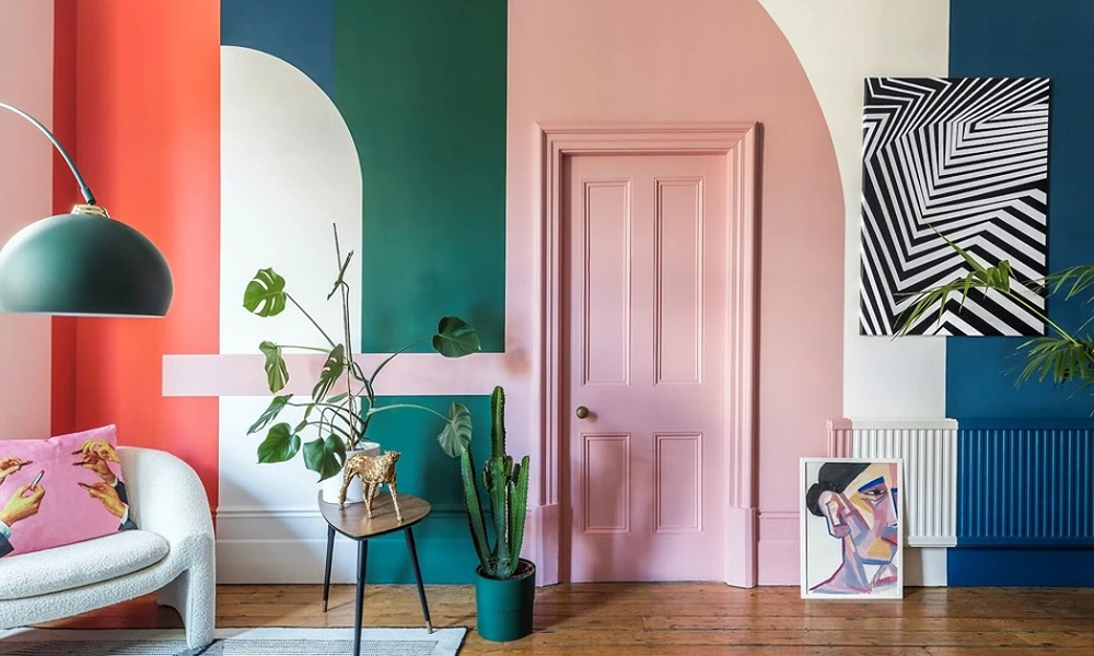
Choosing the right colours can transform a house into a space that feels comfortable, inviting, and thoughtfully designed. While a single shade can create a clean look, combining complementary tones often adds depth and personality. The secret is to balance warm and cool shades, consider natural light, and choose colours according to how each room is used.
Start With a Simple Colour Plan
Before selecting paints, consider the overall mood you want for your home. Warm neutrals such as beige, cream, taupe, terracotta, and soft brown can make rooms feel cosy. Cooler shades such as muted blue, sage green, and soft grey can add freshness without making the space feel stark.
A useful approach is to choose one dominant shade, one supporting colour, and a smaller accent. This creates continuity while allowing individual rooms to have their own character.
Create a Balanced Room Colour Combination
The right room colour combination depends on the room’s size, lighting, furniture, and purpose. For bedrooms, soft combinations such as cream with sage green or warm beige with dusty blue can create a calm atmosphere. Living spaces can handle richer pairings, such as warm ivory with terracotta or light taupe with muted olive.
If a room receives limited natural light, very dark combinations may make it feel smaller. Instead, use a lighter base colour and introduce deeper tones through an accent wall, furniture, curtains, or décor.
For larger, brighter rooms, deeper shades can be used more confidently. A warm accent colour against a neutral background can create a striking focal point without overwhelming the space.
Explore Colour Combinations for Hall Walls
The hall is often the first major interior space guests see, so its colour scheme deserves special attention. Popular colour combinations for hall walls include warm white with earthy brown, beige with muted green, and ivory with terracotta accents.
For a contemporary look, pair a soft neutral with a deeper accent wall. For example, warm greige walls can be complemented by an olive or clay-toned feature wall. If you prefer a classic appearance, cream combined with light brown or subtle gold accents can add warmth while keeping the room elegant.
Remember to test paint samples before committing. A colour can appear different depending on daylight, artificial lighting, flooring, and nearby furniture.
Choose the Right Kitchen Colour
The kitchen colour should balance practicality with visual warmth. Light shades are particularly useful in smaller kitchens because they reflect light and can make the area appear more spacious. Cream, warm white, pale grey, and soft sage are versatile choices.
For a warmer appearance, combine neutral walls with wooden cabinets or earthy accents. A muted green paired with cream can create a fresh yet homely feel, while beige with terracotta accents can give the kitchen a more traditional character.
Since kitchens can have strong lighting and reflective surfaces, avoid choosing colours based only on a small paint card. View samples at different times of day to understand how the shade behaves in the actual space.
Keep the Whole Home Connected
Different rooms do not need identical colours, but they should feel visually connected. Repeating a shade in small doses, through cushions, artwork, cabinetry, curtains, or accessories, can create continuity between spaces.
The best colour scheme is ultimately one that suits your lifestyle and the atmosphere you want to create. By combining a dependable neutral with carefully chosen warm or contrasting shades, you can achieve a home that feels balanced, welcoming, and distinctly your own.
