
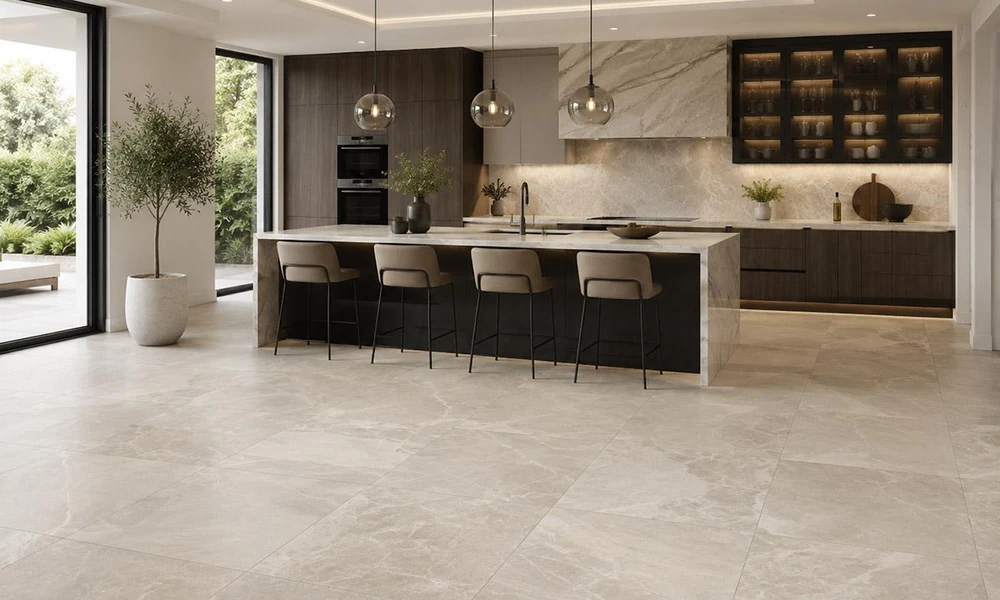
The color, scale, texture, layout, and finish of floor tile establish a visual foundation that influences every other design decision in a space.
Flooring is one of the largest continuous surfaces in any interior, which gives it tremendous influence over how a room looks and feels. Before visitors notice the furniture, lighting, artwork, or decorative accessories, they often register the floor. Its color, texture, pattern, and scale create an immediate impression and help define whether the room feels warm, contemporary, luxurious, relaxed, dramatic, or understated.
Tile is especially effective as a flooring material because it combines visual versatility with practical performance. Porcelain, ceramic, natural stone, and mosaic tile can support a wide range of interior styles while standing up to foot traffic, moisture, spills, dirt, and daily cleaning. Modern manufacturing also allows tile to reproduce the appearance of wood, marble, limestone, concrete, terrazzo, and other materials with remarkable detail.
A light stone-look tile can make a room feel airy and open. Dark charcoal porcelain can create depth and sophistication. Wood-look tile introduces warmth and visual movement, while patterned floor tile brings energy and personality. Large-format surfaces create a calmer, more seamless effect, whereas smaller tiles and mosaics produce greater detail.
Because floor tile is a long-term investment, it should be selected as part of the room’s complete design rather than treated as a background decision. The right floor provides a foundation that helps cabinetry, furniture, wall colors, fixtures, and textiles feel connected. It does not merely cover the surface beneath the room; it establishes the atmosphere for everything placed above it.
Floor Color Establishes the Room’s Emotional Character
Color is one of the first characteristics people notice when entering a room. The floor covers a broad visual area, so its color can significantly influence whether the space feels bright, grounded, warm, cool, intimate, or expansive.
Light-colored tile is often used to create an open and airy atmosphere. Soft white, ivory, beige, pale gray, and limestone tones reflect more light and can make compact rooms feel less visually restricted. These colors work especially well in bathrooms, kitchens, entryways, and open-concept living areas where a clean, continuous foundation is desired.
Warm neutral floors introduce comfort and softness. Sand, cream, taupe, travertine, clay, and warm greige tones pair naturally with wood furniture, brass fixtures, woven textiles, and organic materials. They can make contemporary interiors feel less sterile while supporting traditional, Mediterranean, coastal, and transitional styles.
Cooler gray and concrete-inspired tiles create a more architectural mood. They often complement black metal, chrome, crisp white walls, glass, and minimalist cabinetry. However, gray tile should be evaluated carefully because its undertones can appear blue, green, violet, or brown depending on the lighting and surrounding materials.
Dark floor tile creates visual weight and drama. Charcoal, black, deep brown, slate, and dark stone finishes can anchor a large room and make lighter furniture or cabinetry stand out. In a powder room or luxury bathroom, a dark floor can contribute intimacy and sophistication. Adequate lighting and controlled contrast help prevent the room from feeling too heavy.
Color does not need to be neutral. Deep green, muted blue, terracotta, burgundy, and decorative multicolor tile can give a room a distinct perspective. These stronger choices work particularly well in entryways, powder rooms, laundry rooms, kitchens, and other areas where homeowners want the floor to become a design feature.
The undertone of the tile should relate to the room’s other permanent materials. A warm beige floor may clash with cool-white cabinetry, while a blue-gray tile may feel disconnected from a golden wood finish. Viewing samples beside cabinets, countertops, paint, furniture, and natural light helps reveal these relationships.
“The floor’s color creates the emotional baseline of a room, influencing whether the space feels bright, grounded, warm, dramatic, or calm.”
Because flooring is difficult to replace, homeowners should choose a color they can live with as furniture, paint, and decorative preferences evolve.
Tile Size and Grout Lines Affect the Sense of Space
The size of the tile influences how large, busy, seamless, or detailed a room appears. Large-format tiles create fewer grout joints, which allows the floor to read as a broad continuous surface. Smaller tiles introduce more repetition and visual texture.
Large porcelain tile is popular in modern interiors because it creates a clean, expansive look. Formats such as 24-by-24-inch, 24-by-48-inch, and larger can reduce visual breaks across kitchens, bathrooms, living rooms, and open layouts. Stone- and concrete-look designs are especially effective in these sizes because the larger surface allows veining and tonal variation to be appreciated.
A large-format floor can make a compact room feel less divided, but the layout must be planned carefully. Small spaces may require additional cuts, and narrow pieces along walls or cabinetry can weaken the visual effect. The installer should calculate the starting point so the cuts remain balanced.
Smaller tiles provide more detail and can suit traditional, vintage-inspired, decorative, or highly functional applications. Hexagons, penny rounds, basketweave, and small squares can add character to bathrooms, entryways, and laundry rooms. In showers, smaller formats can also follow the slope toward the drain and provide additional grout joints for traction.
Rectangular plank tile can visually influence the room’s proportions. Long tiles installed parallel to the longest wall may emphasize length, while installation across a narrow room can make it feel wider. The direction should relate to sightlines, doorways, cabinetry, windows, and the flow into adjoining spaces.
Grout color and joint width also affect scale. Grout that closely matches the tile reduces visual divisions, allowing the floor to feel calmer and more continuous. Contrasting grout emphasizes each piece, creating a stronger grid or pattern.
A black-and-white mosaic with contrasting grout becomes highly graphic, while a beige stone-look tile with matching grout creates a quieter foundation. Neither approach is inherently better; the correct choice depends on the desired atmosphere.
The tile’s scale should also relate to the room’s architecture. Very small tile across a large open floor may create excessive visual activity, while an oversized pattern may be difficult to appreciate in a room interrupted by islands, vanities, or walls.
Planning the tile, grout, and layout together allows homeowners to control whether the floor feels seamless, structured, detailed, or dramatic.
Texture and Finish Influence Comfort and Style
Floor tile is experienced visually and physically. Its texture and finish affect how it reflects light, how it feels underfoot, how easily it can be maintained, and how suitable it is for different environments.
Matte tile creates a soft, understated appearance. It reflects less light than polished tile, which can make the floor feel calm and architectural. Matte porcelain is frequently used in kitchens, bathrooms, entryways, and living areas because it offers a contemporary look and may hide smudges or water spots better than highly reflective surfaces.
Honed and satin finishes provide gentle reflection without the mirror-like shine of polished tile. These finishes can feel refined and luxurious while remaining visually restrained.
Polished tile reflects light and may make a room appear brighter and more formal. Marble-look porcelain and natural stone are often selected in polished finishes for luxury interiors. However, some polished surfaces may be slippery when wet and may show footprints, streaks, or scratches more readily. Product ratings should always be reviewed before using polished tile on a floor.
Textured tile can improve traction and add an organic or handcrafted appearance. Stone-look surfaces may contain subtle pits, ridges, or cleft-like variation. Wood-look porcelain may include embossed grain that follows the printed pattern. Concrete-inspired tile can feature soft surface movement that makes it feel less uniform.
Heavy texture can require additional cleaning because dirt may collect within the variation. The ideal finish balances the desired appearance with the room’s practical demands.
Slip resistance is particularly important in bathrooms, laundry rooms, entryways, kitchens, pool areas, and outdoor spaces. A tile that works beautifully on a dry living room floor may not be appropriate in a wet shower. Homeowners should select products specifically rated for the intended use rather than relying only on visual appearance.
The finish also affects how tile color is perceived. Glossy surfaces may appear darker or more saturated because they reflect surrounding objects. Matte surfaces diffuse light and often make colors feel softer. Natural daylight, overhead fixtures, and directional lighting can all change the floor’s appearance.
Rugs, furniture, and textiles can balance the hardness of tile. In living areas or bedrooms, area rugs add softness, absorb sound, and define seating zones while allowing the tile to remain visible around the edges.
When selected thoughtfully, texture and finish contribute both to the room’s visual personality and its everyday comfort.
Floor Tile Can Define Open-Concept Spaces
Open-concept interiors often combine kitchens, dining areas, living rooms, hallways, and entryways within one visual environment. Flooring plays a major role in determining whether these spaces feel connected or fragmented.
Using one tile continuously across several areas can make the home feel larger and more cohesive. The uninterrupted surface allows the eye to move easily from one zone to another. This approach is especially effective in contemporary homes where clean sightlines are part of the architecture.
A warm stone-look porcelain might extend from the entry into the kitchen and living space, creating a unified foundation. Furniture, rugs, lighting, and cabinetry can then define individual areas without introducing abrupt flooring changes.
Continuity can also improve practicality. Porcelain tile performs well in areas where spills, outdoor dirt, moisture, or heavy traffic are common. Carrying it from an entryway into a kitchen eliminates transitions between materials that may wear differently.
However, floor tile can also define specific zones. Patterned tile may be used in an entryway to create a visual arrival point. A kitchen floor can differ from the adjoining living room to distinguish the working area. Mosaic or contrasting tile can define a shower within a larger bathroom.
The transition between tiles should feel intentional. Color, scale, or texture can change while maintaining a shared undertone. For example, a large warm-gray porcelain floor might meet a smaller geometric tile in the laundry room. The formats differ, but the related color connects them.
Open layouts require careful placement of grout lines. Lines may extend through several rooms, making misalignment more noticeable. Installers should consider the longest sightlines and determine where the layout will appear most balanced.
Thresholds, doorways, islands, columns, and changes in floor height should also be planned. A poorly positioned transition can interrupt the open feeling, while a clean level connection makes the materials appear integrated.
“In an open home, floor tile can either unify the architecture or deliberately define individual zones without relying on walls.”
The choice between continuity and contrast depends on the homeowner’s goals, but both approaches require a clear visual strategy.
Patterned Floors Can Become the Room’s Main Design Feature
Not every floor needs to function as a quiet background. Patterned tile can transform the floor into the primary decorative element, giving a room energy, movement, and personality.
Geometric patterns, checkerboard layouts, encaustic-inspired motifs, terrazzo effects, floral designs, and contrasting borders can all create a memorable foundation. These options work particularly well in entryways, powder rooms, laundry rooms, kitchens, mudrooms, and bathrooms.
A patterned floor can simplify decisions elsewhere in the room. When the tile provides strong visual interest, walls, cabinetry, countertops, and furniture can remain relatively restrained. This creates a clear hierarchy and prevents the space from feeling overcrowded.
Black-and-white patterns offer crisp contrast and work across traditional, modern, and transitional interiors. Warm terracotta and cream designs may support Mediterranean or organic styles. Muted blue, green, gray, and beige patterns can introduce personality while maintaining a softer atmosphere.
Checkerboard flooring demonstrates how a pattern can feel both historic and current. Large black-and-white squares create bold contrast, while beige-and-cream or charcoal-and-gray combinations produce a quieter interpretation. Installing the squares diagonally increases movement, whereas a straight grid feels more structured.
Pattern scale should relate to the room. A very large motif may not be visible when covered by an island or vanity. Smaller repeating patterns can adapt more easily around fixtures, although high contrast may create more visual activity.
The layout should be centered on the most important sightline rather than simply beginning at one wall. Entry doors, central axes, vanities, fireplaces, and kitchen islands may determine where the pattern should align.
Printed porcelain offers the appearance of decorative cement or encaustic tile with potentially simpler maintenance. Genuine cement and natural stone products may provide authentic variation but can require sealing and specialized care.
Homeowners should review several pieces or sheets before committing. Some patterned tiles create a larger design when placed together, while others can be rotated to produce different arrangements. Understanding the pattern repeat is essential.
A bold floor is a long-term design decision, but it can remain appealing when the pattern relates to the architecture and uses colors the homeowner genuinely enjoys.
Wood-Look and Stone-Look Tile Shape the Room’s Style
Porcelain tile can reproduce the appearance of natural materials, allowing homeowners to establish a specific mood while benefiting from the performance of tile.
Wood-look porcelain creates warmth and movement through printed grain, knots, and plank variation. It can support farmhouse, coastal, rustic, modern, and transitional interiors. Unlike real wood, it can be used in bathrooms, laundry rooms, kitchens, and other moisture-prone areas when properly installed.
Plank width and color affect the overall style. Wide light-oak looks feel contemporary and airy. Dark walnut tones create richness and formality. Weathered gray or reclaimed-wood effects support industrial and coastal designs, while warm honey tones feel more traditional.
The layout should avoid obvious repetition. High-quality collections often include multiple printed faces, but installers should still blend pieces from several boxes and vary the pattern. Staggering should follow manufacturer recommendations because repeating offsets can make the installation look artificial.
Stone-look porcelain creates a different atmosphere. Limestone and travertine looks feel warm and organic. Slate adds texture and depth. Marble-look tile contributes elegance and movement, while terrazzo-inspired designs provide a playful yet sophisticated appearance.
The advantage of porcelain is its consistency and typically lower maintenance compared with many natural materials. It can provide stone-inspired visuals without the same sealing or sensitivity to acidic products. However, genuine stone offers unique depth and variation that some homeowners prefer.
Concrete-look tile creates a minimal, urban, or architectural foundation. Its subtle tonal movement works well with wood, metal, glass, and sculptural furniture. It is often used in large formats to reduce grout lines and emphasize broad surfaces.
Choosing between wood-, stone-, concrete-, or marble-inspired tile should begin with the desired emotional quality. Wood looks tend to feel warmer and more familiar. Stone communicates permanence and organic elegance. Concrete feels contemporary and restrained. Marble introduces luxury and drama.
These surfaces influence the entire room, so they should be evaluated alongside furniture, cabinetry, and architectural details.
Flooring Should Support Furniture, Cabinetry, and Wall Colors
Floor tile does not need to match the furnishings, but it should establish a relationship with them. The room feels more cohesive when the floor’s undertones, visual movement, and scale support the materials placed above it.
In kitchens, cabinetry is one of the most important considerations. Natural wood cabinets may work best with tile that either complements their warmth or creates intentional cool contrast. White cabinets provide flexibility but can lean warm or cool, affecting which floor colors coordinate successfully.
Dark cabinetry against a dark floor can create a dramatic, enveloping effect, but the room may require lighter countertops, walls, or strong lighting for balance. Dark cabinets over pale tile create clearer contrast and allow each surface to stand out.
Furniture leg styles and visual weight also matter. Large upholstered pieces can cover much of the floor, so the visible tile should frame them attractively. Minimal furniture with raised legs exposes more flooring, making its pattern and texture more prominent.
Wall color can either blend with or contrast against the floor. A soft tonal palette creates calm continuity, while stronger contrast defines the architecture. Beige tile with warm white walls feels subtle and inviting. Charcoal flooring against white walls creates crisp definition.
Rugs provide another opportunity to connect the floor with the room. A rug can repeat a floor undertone, introduce complementary color, or soften a strong pattern. The floor should remain visible around the rug so the relationship feels intentional.
Metal finishes can also respond to the floor. Brass and bronze emphasize warm tile tones, while chrome and nickel suit cooler palettes. Matte black can create graphic contrast against light flooring or blend into darker surfaces.
Material samples should be viewed together under the room’s actual lighting. Digital images and showroom displays may not reveal how undertones interact. A floor that appears neutral on its own may look unexpectedly pink, green, or blue beside another finish.
Durability and Maintenance Affect Long-Term Satisfaction
Floor tile is expected to perform under constant use, so technical qualities are as important as appearance. The correct product should match the room’s traffic, moisture exposure, maintenance needs, and safety requirements.
Porcelain tile is widely used for floors because it is dense, durable, and low in water absorption. It is available in many styles and can be suitable for kitchens, bathrooms, living spaces, entryways, and certain outdoor applications.
Ceramic tile can work well in residential settings, but not every ceramic product is rated for heavy floor use. Specifications should be reviewed before selection.
Natural stone offers authentic beauty but may require sealing, specialized cleaning, and greater acceptance of variation, patina, or etching. Marble, limestone, travertine, slate, and other stones each have different performance characteristics.
Slip resistance is critical in wet and high-traffic areas. Polished tile may be appropriate in certain dry spaces but less suitable near showers, exterior doors, or pools. Matte or textured finishes often offer more traction.
Grout maintenance should also be considered. Large-format tile contains fewer joints, while smaller tile creates more grout lines. Mid-tone grout may conceal everyday dirt better than very light or very dark options.
Dirt is often more visible on floors with strong solid colors. Black tile can show dust, lint, and mineral residue, while bright white floors may reveal hair and debris. Stone-look and subtly varied surfaces tend to be more forgiving.
Radiant heating can improve comfort in colder climates or bathrooms where tile might otherwise feel cool underfoot. The heating system must be planned with the installation materials and substrate.
Proper installation protects the floor from cracking, movement, uneven joints, and lippage. The substrate must be stable and appropriately prepared. Expansion and movement joints should be incorporated where required.
Homeowners should order extra tile for cuts, breakage, and future repairs. Product batches can vary, and discontinued collections may be difficult to replace.
A well-chosen floor should fit not only the design vision but also the realities of the household, including pets, children, frequent entertaining, cleaning habits, and accessibility needs.
Frequently Asked Questions About Floor Tile
What floor tile makes a room look larger?
Light-colored large-format tile with closely matched grout can reduce visual breaks and make a room feel more expansive. Continuous flooring across adjoining areas can strengthen this effect.
Should floor tile be lighter or darker than the walls?
Either can work. A darker floor grounds the room and creates contrast, while a lighter floor produces a softer, airier appearance. The choice depends on lighting, room size, and the desired atmosphere.
Is porcelain tile good for high-traffic rooms?
Yes. Many porcelain tiles are designed for high-traffic residential areas because they are dense, durable, and resistant to common wear. Product ratings should still be checked for the intended application.
Can large-format tile work in a small room?
Yes. Large tile can reduce grout lines and create a cleaner appearance. Careful layout planning is essential to prevent awkward or excessively narrow cuts.
What grout color is best for floor tile?
A grout close to the tile color creates continuity, while contrasting grout emphasizes the pattern. Mid-tone grout may be easier to maintain in busy areas than very light grout.
Can the same tile be used throughout an entire home?
Yes, provided it is suitable for each application. Continuous tile can create cohesion, especially in open-concept homes. Different formats or coordinating mosaics can add variation in bathrooms and other specialized areas.
Find the Right Floor Tile at Trendy Surfaces
Floor tile establishes the visual foundation for an entire room. Its color influences mood, its scale affects the sense of space, and its texture shapes both style and everyday performance. Whether the goal is a seamless neutral floor, warm wood-inspired surface, luxurious marble look, or bold decorative pattern, the tile will guide many of the decisions that follow.
The strongest results come from balancing design with function. Before making a final selection, consider room proportions, grout, lighting, furniture, cabinetry, traffic, moisture, maintenance, and installation requirements.
Trendy Surfaces helps homeowners, designers, contractors, and renovation professionals explore floor tile for kitchens, bathrooms, entryways, living spaces, laundry rooms, and complete home projects. From durable porcelain and realistic stone looks to decorative patterns and contemporary large formats, Trendy Surfaces can help you find flooring that defines the room beautifully and performs reliably.
Visit Trendy Surfaces to discover floor tile options and create a foundation that supports the style, comfort, and character of your entire interior.
